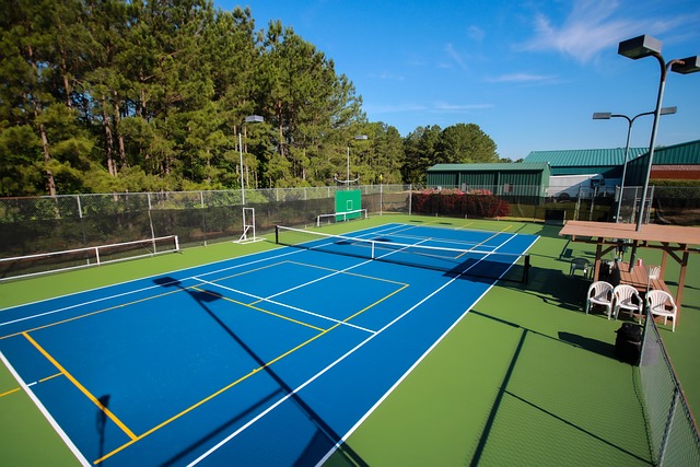
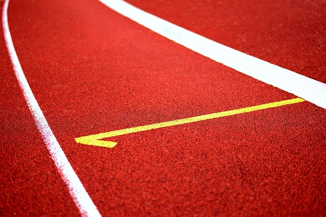
In the United States, tennis courts often display this energetic combination of dark green and blue. The outer zone is a matte green, and the playing area is a bright blue. Their vibrant shades offer visibility to players to easily track the ball while minimizing glare, a crucial feature for daytime matches.
📌 Hub Guide: 5 Best Wilson Tennis Racquet 2026: Top Picks & Buyer’s Guide
Blue has since become the industry standard for pro tournaments such as the US Open. It allows courts to have a very contemporary aesthetic with well defined boundaries. While technicolor courts have become the rage, some public parks are returning to all-green or even red for a traditional look.
In sunny, warmer states, using lighter colors will allow courts to stay cooler under the sun. Choosing the right tennis court colours means thinking about looks, how easy it is to see the ball, and how well the colours hold up outside. The body discusses our primary picks and what makes them effective.
What Are Common Court Colors?
Tennis courts reveal an interesting variety of colors that are governed by tradition, use, and aesthetics. The color you choose is important for more than aesthetics. It affects the way children play, enhances player concentration, and even alters the way we view sports on television.
Although green and red are deeply rooted in tennis tradition, blue courts now dominate at major tournaments around the globe. Other colors, such as gray and custom rare color tones increase the selection further, particularly for private or urban courts. This section explores the most popular court colors, their cultural significance, and what they add to the game.
1. The Classic Green Court Look
The green court has been a classic tennis color for many years. Often tied to the sport’s history, appearing at local clubs to state parks to pro tours for over 40 years. Green works best with the great outdoors, easily blending in with grass or trees surrounding most courts.
This combination makes the courts’ contrasting colors less visually intrusive and helps produce a more peaceful environment to play in. The green color tends to complement the yellow color of the tennis ball. Rich in contrast, this color provides great visibility and makes the ball stand out on the court.
This is really important for the players and fans alike since it reduces a lot of missed shots and chaos. The eye also finds green restful, which can help players remain unagitated and return their attention to the game. This comfort is an underappreciated yet very tangible advantage, particularly when the stakes are highest in clutch games.
Green isn’t just about honoring tradition. Many new court builds still go with it. Typically, these designs feature a two-color scheme, with darker and lighter greens contrasting to delineate the court area and the surrounding space. This updates the aesthetic, while still retaining a connection to the sport’s traditional aesthetic.
2. Why Blue Courts Took Over
As a result, blue courts are currently the preferred choice for major competitions. This dramatic shift started only recently, in 2005. That’s when the US Open introduced its flashy new color, US Open Blue, aka Pantone Blue 2965U. This decision followed extensive trials for optimal ball visibility.
The yellow ball looks great against blue, players and fans can follow the ball much better. Blue has the added benefit of projecting a serene atmosphere onto the court. It’s still easy on the eyes but crisp enough to allow for sharp details and focus.
Blue courts are favored by TV broadcasters because they increase visibility. The ball and lines pop significantly, even under high powered lights or on a device of any size. This most importantly makes the court-viewing experience much better for the millions watching at home.
The Australian Open courts are an even lighter blue, giving those courts a particularly vivid and almost futuristic appearance. Smaller tournaments and college matches have adopted this trend, too. That’s why they have all started to opt for different shades of blue to help their courts pop.
So blue has taken off to the point where it’s almost become the default color for hard courts. This trend is most apparent in North America and Australia.
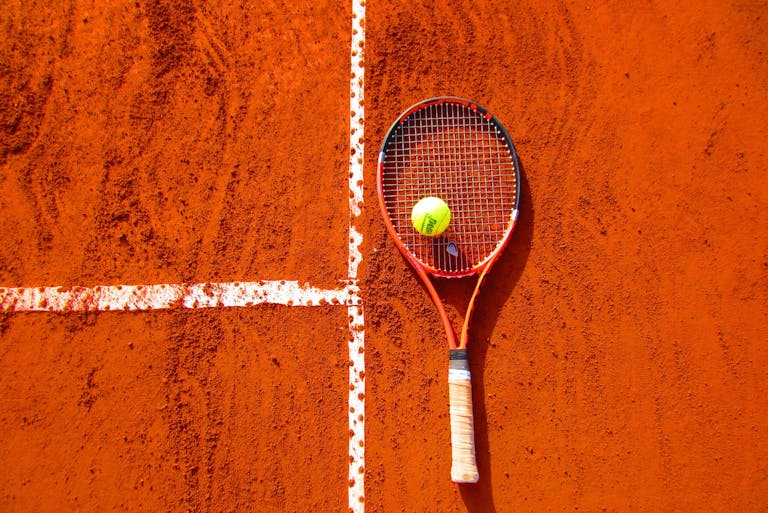
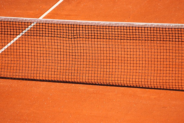
3. Red Clay: A Different Vibe
Red clay courts are easily identifiable from their dark, earthy color. These courts aren’t only visually stunning, they influence the style of play on the court. The grand slam held in Paris, the French Open, the most prominent clay tournament in the world, plays on this surface.
In India, red clay is the rule, with dark green surrounding the court to provide a rich and classic aesthetic. The deep red clay provides a beautiful contrast for the bright yellow tennis ball. It does become very dusty and tends to stick to clothing and shoes.
In addition, clay slows down the ball and causes it to bounce higher, resulting in longer exchanges. This alters gameplay strategy and benefits players who are patient and play good defense. Red clay’s earthy color offers a strong contrast with green lawns or plants nearby, giving courts a lively look.
4. Grass Courts: Naturally Green
Grass courts are a return to tennis’s roots. Wimbledon, the most prestigious of all tennis tournaments, is best known for its all-green grass courts. Grass courts aren’t commonly found anymore, due in large part to the difficult maintenance.
They require constant mowing, watering, and maintenance to keep them smooth and safe. Grass tends to be fast and the ball will skid low to the ground. This makes for a quicker pace of play and gives a premium to quick reaction times.

The natural green color is great for the eyes, evoking a classic, almost regal aesthetic to the game. Grass courts are very rare in the US. You’ll see them more often in the UK and Australia, where the courts are home to historic clubs and traditional tournaments.
5. Two-Tone Designs Explained
Courts are painted in two colors, usually different shades of the same color, to highlight primary playing areas and the surrounding zones. As a result, one popular design has the playing box in a darker green color and the surrounding area in a lighter green shade.
This delineates exactly where play occurs and gives a fresh take on schoolyard aesthetics. Contrast increases visibility for players, allowing them to better determine lines and spacing. Two-tone designs allow teams and schools to inject more flair while still maintaining the benefit of functionality.
In fact, they are best suited for green-blue configurations. You can apply this same red or gray layout trick with any two colors to create this effective visual breakup.
6. Less Common Court Color Choices
Courts that violate the norm with daring colors. Gray has found a lot of fans, largely in urban areas, as it absorbs less heat and provides a modern, metropolitan aesthetic. Purple, teal, and orange courts are more common private home or special event appearances.
These uncommon colors can reflect the owner’s individuality or complement the aesthetic of a team. They can be practical, such as reducing glare, or adapting to local climates. You’ll find plenty of examples in high-end resorts, rooftop courts, and college campuses that are looking to establish a distinctive look.
7. How Colors Define Playing Areas
The use of color is not merely aesthetic. It defines different zones—playing area, baseline, and out-of-bounds. Good contrast makes it easier for players to read the space quickly, reduce errors, and maintain a good flow of play.
Beyond affect, color has been shown to influence mood and attention. Cool tones such as blue and green produce a soothing effect on the mind, whereas bright colors are associated with energy or distraction.
A well-coordinated color scheme goes a long way in making courts look professional and ensuring fans stay focused. On TV, bright court colors also make it easier for viewers to follow the ball, which makes the games more exciting to view.
This is especially true in the club and school space where many courts exist solely to showcase a club/school’s colors and identity.
How Color Affects Playability
Let’s take a look at how tennis court color impacts playability. It is responsible for influencing how players perceive the ball, how they navigate the court, and how they maintain their energy while playing. In the U.S., blue courts have taken over, most notably at the US Open and Australian Open.
This science-based, performance-driven, comfort-conscious choice of color allows players to meld into the art of the game.
See the Ball Better: Visibility Factors
If players cannot see the ball right away, they are not able to play their best. Blue courts create a clear dichotomy that allows players to easily follow the yellow or white ball. No wonder blue is the overwhelming color of choice in most professional tournaments.
These white lines draw attention on a blue playing surface, making it easier for players and umpires to see. When courts are dark green and the lines are bright white, they merge almost completely. This creates a larger challenge of being able to see the lines from the court.
Players say high-contrast combos like blue and white help them focus longer and cut down on eye strain, especially when the sun is bright or clouds roll in.
Does Color Change Court Speed?
Court color can change the perception of how fast the game is going. The argument is that darker colors create the illusion of a faster moving ball while lighter hues are able to slow the eye.
While the physical surface certainly has greater impact, anecdotal evidence from players indicates that color can create a perception that a court “plays” fast or slow. The science is still playing catch up; what players perceive and experience in terms of color directly dictates how they react.
Heat Matters: Dark vs. Light Surfaces
Dark colored courts absorb more sunlight, and therefore more heat, making for hotter surfaces. That heat can affect ball playability and fatigue players during lengthy matches.
Lighter colors reflect more sunlight, helping to keep courts from heating up as much. In sunnier states such as California, lighter-colored courts are usually selected to combat the heat.
Playing Comfort Under the Sun
Color makes a difference — It’s all about comfort. Since lighter colors reflect sunlight, they help to lower surface temps and keep players cooler.
This greatly aids concentration and endurance, giving the appearance that the matches are not so taxing. Choosing the appropriate color allows players to play longer, be more comfortable, and have a better game experience.
Night Games and Color Visibility
Under lights, bright colors stand out more than muted tones. Blue courts perform well at night as well, maintaining the visibility of the ball and clarity of the lines.
Choosing the right colors for tennis courts is increasingly important, with blue and other vibrant colors paving the way.
US Standards and Preferences
In the United States, tennis court colors are dictated by law and local preference. Governing bodies similar to the United States Tennis Association (USTA) dictate any tournament rules. At the same time, local chapters and communities adapt their methods to what works best for their community.
Like all those standard features, over the years, these standards begin to define how courts look and function, creating a better experience for players and fans alike.
Official Tournament Color Rules
Major US Tournaments have very strict color rules. For instance, the US Open features a blue inner court with a green outer court. This dramatic change, made official in 2005, was designed to allow players to have better visibility of the ball and lines.
Over the past few years that blue-and-green color scheme has become ubiquitous at pro events around the country. These rules are set by the USTA and International Tennis Federation (ITF). This provides for a uniform appearance of venues and a comfortable environment that people have come to expect.
Yet, some events continue to experiment with fresh appearances. There are a couple exceptions, where some tournaments implement red courts with green surrounds, or just permit modifications for local flavor, but these are few and far between.
Why Contrast Lines Are Key
Contrast lines are key. Fair play requires that lines stand out fiercely. White or bright yellow are the standard options, catching the eye even in contrast to blue or green backgrounds.
Clean delineation allows players to make sharp decisions and avoid costly errors. Providing good contrast not only improves gameplay, it helps viewership. Courts with contrast line color, such as blue courts with white lines, have a fresh and contemporary aesthetic.
Regional Color Trends Across the US
Whether you’re talking tabletop or digital gaming, preferences change based on where you’re playing. The blue and green combination is the most common one! In most neighborhoods, you’ll see a basketball court in dark or pastel colors.
All-green courts, which were a fad in the ’80s, are the exception rather than the rule these days. Some opponents just don’t like all-brown or all-gray courts, claiming that they’re visually jarring.
Color palettes often reflect this regional difference, with West Coast cities opting for more adventurous palettes and the Southeast remaining anchored to tradition.
Climate Influence on Color Choice
Climate plays a huge role in determining what colors and materials work best. In hotter states, lighter colored courts help to reflect the heat and keep the surface temperature cooler.
In temperate zones, darker colors are used to keep the court warm. Choosing the best color can help increase comfort and safety, particularly in areas with high sun exposure or heavy precipitation.
Picking Your Perfect Court Colors
It is important to remember that choosing tennis court colors involves more than just choosing your favorite colors of paint. The right color can completely transform the appearance, vibe, and even playability of your court.
Color selection impacts visibility, heat absorption, maintenance, and aesthetics so it is important to consider all of these factors before deciding on a color.
Match Your Home or Landscape
Court colors to match your home or landscape Coordinating court colors with your home or landscape creates a harmonious, polished look. For instance, a combination of sage green with moss green will complement lawns and gardens beautifully, creating a soothing, sophisticated appearance.
Gray courts sit in harmony with contemporary residences and are becoming increasingly popular in urban settings. Matching local architecture—be it stucco, brick, or wood—can go a long way to make your new court feel right at home.
Choosing a well-matched court can even increase your property value by linking the court to your home’s aesthetic.
Consider Local Weather Patterns
Consider Local Weather Patterns Colors with high reflectance, such as Light Blue and Grey are best suited for hotter climates. They don’t absorb as much heat, which makes your court cooler for players.
Darker hues may look amazing, but darker colors absorb heat and dry out more quickly. Certain colors hold up best in the sun and in the rain.
Selecting colors that can withstand the elements pays off, particularly in areas with distinct seasons.
Think About Long-Term Upkeep
Some colors accentuate dirt, leaves, or cracks more easily. Consider that while lighter colors can be better at concealing scuff marks and dust, darker shades often require increased maintenance.
Durable, easy-care colors minimize both labor and expense over time. Select court paint or surfacing products that have a proven reputation for durability in your local climate.
Popular Two-Tone Combinations
Not only are two-tone courts functional, they look clean and professional. Blue and green courts are really popular right now, especially at major tournaments.
Colors like sage and moss green are classic. These combos make the ball easier to see in any light conditions and keep players focused and engaged.
Two-tones allow you to still mix and match colors to suit your style.
Creative Color Ideas for Fun Courts
If you are designing a casual or rec court, definitely go with bright colors. Light blues, reds, and yellows go a long way in making courts feel inviting and fun.
Other courts across the globe incorporate zany patterns or regional artwork providing an artistic flair. This is a great opportunity to express personal style and make play more enjoyable.
Material Impacts on Color
The chosen material for a tennis court dictates how color is applied, expected to wear over time, and perform in play. Various surfaces—hard, clay, or grass—provide their own set of color options. Choosing the correct material and color combination plays into maintenance and how the court will look in the coming years.
For American courts, local weather and sun exposure are major factors in how well colors will wear over time.
Hard Court Color Options
Wide Color Range Hard courts, which are produced with asphalt or concrete base topped with acrylic coatings, provide the most color options. Blue, green, and red are frequent. For this reason, blue courts, such as those used at the US Open, greatly improve players’ and viewers’ ability to see the yellow ball.
Green courts, a tribute to tradition, fade into grass backdrops. Lighter blues, like those used at the Australian Open, are trending for their crisp appearance. Two-tone color schemes, such as blue with green edges, can create a beautiful, decorative appearance and emphasize bordered lines.
Color choices are about more than beauty. They make the game better as well, with better ball visibility and less glare on TV images.
Clay Court Color Nuances
Clay courts can range in color from reds to oranges and even green. The red clay of Roland Garros may be the most iconic, but green “Har-Tru” can be found across the U.S. These terrene tints adhere to their substrate counterparts.
Clay’s color is affected by moisture content and the sun, so courts can appear starkly different from one day to the next. Gentler shades are better at minimizing glare. Though colored clay makes a beautiful statement, it is difficult to keep it looking even and vibrant, which takes a considerable amount of care to maintain its look and playability.
Maintaining Color on Different Surfaces
Maintaining bright, consistent color over time relies on high-quality coatings, and regular maintenance and cleaning. Tennis hard courts retain their color well when painted with high-grade acrylic elastomeric enamels; however, sun and rain can wash out their color over time.
Clay courts require daily brushing and watering, as both play and weather quickly degrade the surface. Applying UV-resistant coatings and choosing colors formulated for the local climate prevent courts from looking sun-faded right out of the gate.
Bright color is important both for play and for the court’s overall aesthetics.
Our Unique View on Court Color
Court color is not just a canvas for the action on the court. Everyone interprets color differently, based largely on their preferences or what they are used to seeing if they have played elsewhere. Some players say blue courts help them spot the ball fast, while others find purple and lime green combos hard on the eyes, even needing sunglasses.
Personal stories are important, and they are powerful. For those of us who grew up playing on green courts, it feels a little weird hitting on blue clay. Feedback from players is critical. What looks slick to some may distract others and take them out of their zone. Change is happening, one court at a time! Bright and bold colors, including reds and purples, are trending today and making the old green standard a thing of the past.
Beyond Visibility: The Feel of Color
Beyond visibility— The vibe of color. Perhaps most importantly, it’s a branding tool—it sets the tone of their matches. Warm colors, such as orange or red, stimulate energy and excitement, whereas cool colors, like blue, soothe nerves.
Even with good visibility, the wrong color combination can make players feel unstable. In turn, this results in an increased ability to focus and decreased levels of stress, allowing matches to be more entertaining. A court with two greens—one for play, one for borders—creates an understated, timeless elegance. Conversely, brightly colored courts can evoke that same sense of excitement and entertainment to the game, to the players, and to the spectators.
Does Tradition Outweigh Tech?
We know tennis has a long history, but today’s technology allows us to experiment with new concepts. Other courts mix classic green with vibrant pops of color. Locations in Australia and Asia now prefer blue, demonstrating how localities influence trends.
The challenge lies in respecting our history while not being closed to new ideas.
Color Psychology on the Court
Psychologically, color plays a big role in how competing players perceive and make decisions. Programmed for Play. Color psychology on the court. Blue courts can increase concentration, while crazy colors may confuse.
Whether designing a court or a city, designers need to understand how color impacts mood and crowd excitement. A court’s color scheme can significantly influence how fans perceive the game.
Why We Prefer Certain Combos
Cultural connections, traditions, and simply what people are familiar with all contribute. We know that fans appreciate quality color combinations too—like all the blues with white or all the green with the cream.
Some combos, however, create serious challenges to seeing the ball, so there is a fine line with balance.
Color, Viewing, and Broadcasts
Color has been an important aspect of how people experience tennis, whether on television or in person at the tennis court. For TV broadcasts, picking the right court color means fans at home can see the ball better and enjoy the match more. Many viewers have trouble tracking the yellow tennis ball on red or orange clay, especially during certain lighting like late in the day.
This can lead to a frustrating experience where even with an HD TV or after players change their screen settings the game is still hard to see.
Making Tennis TV-Friendly
Televisors and event planners prefer court colors that make the ball easily visible. Low contrast between the player and the court is important. That’s the reason courts such as the US Open use a blue surface with white lines.
The yellow ball really pops out on screen! Other events have experimented with blue or brownish clay to create a more distinct contrast for viewers tracking the ball. Making tennis TV-friendly colors benefit fans at home, as well as the players and tournament organizers.
They assist broadcasters in presenting the game more appealingly, and thus retaining viewers for longer. Courts are now often designed with TV in mind, and broadcasters sometimes guide color choices to make sure the action looks sharp.
How Color Impacts Spectators Live
During untelevised bouts at the arena, color plays a big role in creating atmosphere and guiding viewer experience. Highly saturated, non-reflective court colors allow the audience to more clearly view quick exchanges. Proper lighting, even source brightness, and thoughtful color distribution all contribute to ensuring the best experience for those in attendance.
Even fans with 20/20 vision have trouble tracking the ball at times. Utilizing two-tone balls or courts with higher contrast backgrounds would be beneficial. Color can brighten the atmosphere, maintain viewer interest, and create a celebratory and enjoyable experience for all attendees.
Future Tennis Court Color Trends
Tennis court color trends are changing with new technology and sustainable practices. Graphic designers are currently working to improve visibility for players on the court and for spectators as well, creating easier-to-see balls. This is why blue and purple courts have been the most popular colors over the past several years, as they help yellow balls really pop. This benefits everyone from the professionals to the recreational players. Trends are constantly evolving as the needs evolve.
Smarter Surfaces, Smarter Colors?
Alternatives to traditional asphalt and concrete, new court surfaces, and other innovations are influencing color trends. Climate-adaptive materials are making their way onto test courts, particularly in perpetually sun-kissed locales such as Southern California and Florida. These surfaces tend to fade very quickly, and designers today seek colors that remain vibrant under direct, high-intensity lighting.
There’s been discussion of introducing lighter undercoats to reduce heat retention at the surface level. While this could keep courts cooler, it remains to be seen whether this will have the effect of dulling any topcoat colors. Smart materials could change color with the weather or time of day, but it’s early days.
Blue clay, such as that used at the Madrid Open, illustrates how important surface selections can be. Such unique surfaces would certainly make a statement on the sports landscape.
Eco-Friendly Color Technology
Eco-friendly color technology is becoming more widely available. Clubs and schools prefer paints with greater durability and eco-friendly production processes. Today, many choose colors that absorb less light, reducing heat.
Eco-friendly alternatives further address emerging local regulations concerning chemicals and runoff. To meet this increasing demand, brands have begun to introduce lines of low-VOC and water-based paints. These not only protect the environment, but provide courts with striking, long-lasting color.
Customization is Getting Easier
Customization is getting easier. Custom court colors have been all the rage this year. Advanced technology is allowing facility owners to choose colors that represent a professional sports team, corporate brand, or local school.
Other venues employ vibrant, multicolored hardcourts to make a statement. Players appreciate when colors match their personal style or serve to improve player visibility of the ball. Customization is getting easier to steer clear of distracting combos too, such as purple and lime green.
Conclusion
Tennis court colors do more than catch the eye. They help players see the ball, shape the game, and set the mood for fans. In the U.S., blue and green are still the most popular colors, but colorful choices are on the rise. Sun, surface type, and level of play all determine which color is best for each court.
While big matches on television help drive these trends, individual local clubs are usually more traditional. Whether it’s design or practicality that inspires you, the right color choice will make every player step up their game and have more fun while doing it. Have a specific court you love or an idea for something different? Look around to see what fits your area best and make your court reflect your personality.
Frequently Asked Questions
What are the most popular tennis court colors in the United States?
What are the most popular tennis court colors in the United States? Blue courts, such as those at the US Open, provide excellent ball contrast and an iconic appearance.
Do tennis court colors affect how the game is played?
Vote Yes, court colors can affect visibility and tracking the ball. Colors such as blue and green allow players and viewers to see the ball better and track its movement, even when playing in strong daylight conditions.
Are there specific color standards for tennis courts in the U.S.?
The answer is yes — The United States Tennis Association (USTA) has adopted a color standard that uses blue for the court and green surrounding out-of-bounds areas. These colors assist with visibility for players and spectators.
How should I choose the best color for my tennis court?
Consider visibility, climate, and your personal style when selecting colors. In hotter and more sunny areas such as LA, lighter shades decrease the amount of heat absorbed by your surface, keeping everyone more comfortable while playing.
Does the type of court material affect color choices?
Definitely, definitely. Some materials, such as acrylic, are better at holding color and resisting the effects of sun exposure over time. As with all things color, make sure you take into account the durability of color with your selected court surface.
Why do broadcasts often prefer blue tennis courts?
Blue courts create a high level of contrast with the yellow tennis balls, helping TV viewers more easily track the action. This is why so many of the major tournaments are played on blue surfaces.
Are there any trends in tennis court colors for the future?
Are there any trends in tennis court colors for the future? Eco-friendly, heat-reflective coatings are gaining in popularity as well, particularly in warmer climates such as Southern California.
❓ Frequently Asked Questions
What does this guide cover about tennis court colours: tips for choosing the perfect court design?
A complete 2026 resource for tennis players — key facts, expert tips, and practical advice without filler.
Is tennis court colours: tips for choosing the perfect court design important for tennis players?
Yes — it directly affects performance, gear choices, and how you approach training and competition.